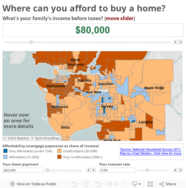
One the the biggest issues facing Metro Vancouver is housing affordability. We have some of the most expensive housing in the world and we are low on any of the affordability measures used worldwide.
A lovely visualization I cam across recently, by Chad Skelton of the Vancouver Sun, shows how you can take a public data set – in this case the National Household survey of 2011, and use a free data viz tool – in this case Tableau public, to create a compelling graphic. It allows you to explore affordability in Metro vancouver by showing you, for different gross incomes, what you can afford around Metro Vancouver. It even allows you to change the downpayment and interest rate so that you can really see where you can afford to buy!
I’ve embedded it below if you want to play –